
When thinking about business logo design, it is important to remember your logo is the face of your brand. It is often the first thing people see when reading your website, leaflet, business card or van.
It is critical to get it right, and when done correctly it immediately creates assertions in the viewer’s mind, think green fields and crops you think of a natural, organic, friendly company.
Get it wrong and you look like an amateur business that isn’t the best in the market.
There are a number of considerations that you can think about when starting your business logo design, we have outlined what we think about when we are working with a client to produce their business logo design. Feel free to follow our advice, but remember these are guidelines and it is OK to break convention for the right reasons!
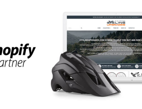
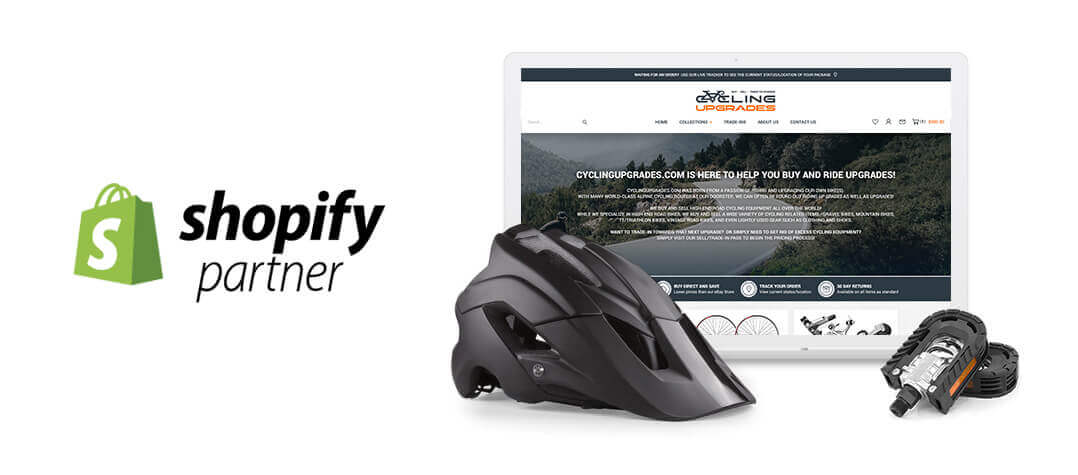
We work with clients every day to produce a business logo design as part of their ecommerce website design development.
1. Include just your business name (Not .com)
When it comes to your business logo, simplicity is often the key. When designing a business logo or website it is easier to add lots of unnecessary features, the true skill is choosing what to leave out.
Your business logo design should include just your readable business name. Don’t add .com or .co.uk on the end, leave out the ltd or plc. Just use the main name that you are known by.
This keeps the logo uncluttered but more importantly means you don’t have to change your logo if your website or status changes, it also means you can use the same logo on each medium, e.g. business cards, vans, social media.
2. Use a readable, simple font
Again, simplicity raises its head. You may have less than a second for someone to see and recognise your logo as a van whooshes by or a leaflet gets pushed in the bin. Give your audience chance to read your name.
Complex script fonts are a no-go, clever fonts that have to be studied to understand should be avoided (unless it really fits the style of the business). Keep with 1 or maximum 2 fonts. Personally I choose to use 2 styles of the same font, a bold and lighter font to create a difference in priority while retaining consistency.
Avoid copying fonts or using really popular fonts, if you use the Facebook font (for example) you may actually make viewers recognise and associate with Facebook rather than your company name. Next thing you know they have just ignored your brand and spent 10 minutes scrolling through their feed.
![]()
3. Create a simple graphic
A graphic is not essential when designing your business logo, but it can help when you need to use your logo in areas where text is not possible (think of the social icons at the bottom of most websites).
Simplicity is most important when it comes to the graphic. A complicated image will not work when scaled down to a few pixels. The image needs to be instantly recognisable, unique and recognisable without any supporting text.
Avoid special effects such as shadow, reflection and shine effects. They date quickly, limit your logo to certain background colours and do not scale well.
Some companies choose an abstract logo or shapes (Pepsi), others have graphics that relate to the company name (Apple, Shell and Target), finally some have a logo that is related to their product, industry or story (Starbucks or Microsoft). Think how a graphic would relate to your story and business, then find a way to simplify that image.
Whichever graphic form you choose, remember that it will be replicated and must work in black and white as well as colour so don’t rely on a graphic that only works with full colour.
Keep in mind single colours are often much cheaper to print.
![]()
![]()
4. Vector format
When designing or paying for a business logo design, ensure you get a vector format of your logo. Vectors (as apposed to bitmap) images are scalable to any size, this means they can be printed on a postage stamp or a building without losing quality.
Vector formats include .AI, .EPS, .PDF or SVG files.
Some formats can be used natively on the web with modern browsers. Vector formats take additional time and may incur higher costs but it is worth it in the long run.
Most printers will only take CMYK vector format graphics.
You can create your own vector graphics using Adobe Illustrator.
5. Include your colour schemes
With branding, your colours can communicate a lot about your business. Be clever about your brand colours. Be aware that somewhere you will need a black and white version of your logo (e.g. invoices and receipts).
Make sure your colours work on most backgrounds on screen AND print. Some bright yellows look fine on a white background on screen but almost disappear when printed onto white paper.
If applicable tie the colour scheme to the industry you are in (green for nature and agricultural, yellow and black for tools).
Some brands are so synonymous with their company colour that they can be recognised by the colour alone. Think Coca Cola rebranding Santa Claus and McDonalds carrying the colour scheme down to the seat colours.
Your logo should be designed using CMYK colours as these are required for print and lead to a much closer colour match between screen and print.
6. Communicate what you do
Let your logo allude to what you do. This can be done with the company name (Pizza Hut & Staples) or in the graphic (Microsoft and Frooition). It helps people instantly understand what you do and they form pre-conceptions about the business. This can be useful in a busy mall or crowded web industry.
It is important to do this without overcrowding the design.
7. Have different, recognisable layouts
Many different platforms and outlets will require different layouts of your logo. On your website and controlled media, you may have a horizontal layout which is your preferred layout. Platforms (particularly social platforms) will dictate that profile pics and logos are square. If you just put your horizontal logo in the middle of a square your are making your brand a lot smaller than you need to. Instead create a square version of your logo.
![]()
8. Use equal, balanced spacing
When designing the logo, create your business logo design using rulers and equal spacing: rather than designed by eye.
Use the same spacing between letters, words and icons. Create an equal padding around the logo. It ensures the logo looks “right” everywhere.
If you have multiple words in the logo ensure they are balanced or consider changing your wording or layout. An unbalanced logo looks amateur and will make the business seem less professional.
9. Pass the business Logo design tests
When creating a business logo design, Frooition come up with a number of logo mockups and narrow dow to the clients favourite.
Once a logo design is chosen we run the logo through a number of tests:
- Print the logo in full colour, very small, normal and very large. You can then check the logo looks good at all sizes but also see how well the logo colour matches to screen views
- Run the logo past people who have not seen it before, see if they can tell what the logo is and what they think about the company when they first see it.
- Print the logo in black and white and colour on a white, grey and black backgrounds. If any features are lost you may need to create an inverted version of the logo.
- If you have a graphic print the graphic on its own without the text and see if it still makes sense and passes the previous tests.
- Finally, do a revers image search of your logo on Google, does it come up with a logo that is very similar to another brand, sometimes you think you are having inspiration but really your subconscious is regurgitating something you’ve seen before.
Do these tests now and you can save yourself a lot of heartache and cost in the future.
Speak to Frooition about commissioning a business logo design or ecommerce website design!

