Branding and eBay’s new logo
Some may simply say “what’s in a logo?” or “branding doesn’t work today!”. Yet, if we’re honest we all recognise companies by their branding, whether it’s their logo, company colours or even their company headline “Every little helps”.
It’s this branding that sets great companies apart from good companies and earns them invaluable mindshare of prospects and clients.
“the key aim of branding is to obtain relevant mindshare”
Mindshare (current awareness and popularity) is what every company strive to obtain; being remembered at the forefront of client’s minds in order to trigger a buying action (referrals or sales).
To help trigger buying actions businesses support their branding with recognisable colours, headlines, music and products which associate to their company, in some cases they even use actors or specific voice over’s like Churchill insurance. When a client is exposed to these brand elements they associate products to it which in turn triggers the brand connection and mindshare.
Some of the best mindshare examples to note (yet more simple examples) is ‘Sellotape’ or ‘Hoover’ both of which are regularly referred to yet Sellotape is actually a brand of cellulose tape and Hoover a brand of a vacuum cleaner. Both companies have managed to acquire so much mindshare they’ve become recognised as the product. Whilst a dream come true for many brand companies, a brand can become too familiar which can have a detrimental effect, as clients no longer look for the brand but rather the recognised product.
Moving with the times…
Time is constantly moving forward and with it buyer trends and expectations. eBay understand this; their market of today is very different from back in 1995 when the company was first founded. Back then, eBay was more like a giant online jumble sale with all kinds of odds and ends available for sale. While the eBay of today now contains the majority of the world’s leading brands in fashion, electronics, computers and even vehicles!
To reflect this, eBay have updated their branding to more accurately reflect their market of today, we asked for thoughts from our Senior Marketing Executive Chris Reeves to describe how the new logo reflects their market.
Consider the following logos:
eBay’s Old Logo |
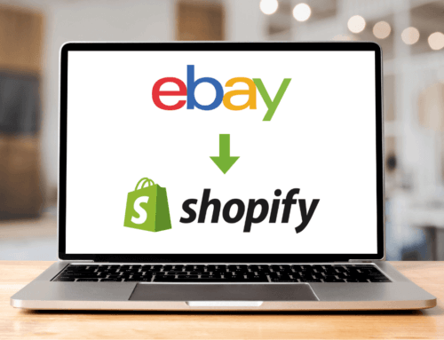
eBay’s New Logo
|
| Comments:
Jumbled, playful, random, very much the eBay of 1995. |
Comments:
Looks current, clean, sharp and almost fashionable, reflecting the eBay of today. |
So, the real question, when was the last time you reviewed your branding logo?
Like this? Please share and like us on Facebook!


