

Share This Blog Post
Colour is one of the most powerful elements of a designer’s toolkit. The best colour schemes for ecommerce websites grab attention, evoke emotion and carry meaning.
Colours play a significant role in establishing a strong brand recognition that helps in boosting conversion.
90% of impulsive decisions to buy a product are based on colour alone.
So colour is important.
But how do designers come up with the right colours to project your brand identity?
You can use this article as a guide to start defining a process for choosing the right colour palette for your next brand or website.
Content:
- What colours say to customers.
- Choosing colours to work together.
- Minimal ecommerce website design and the isolation effect.
What Colours say to us
Each colour has its individuality and evokes specific emotions within the viewer. Some of the most commonly used colours are given below.
Red
Strength, passion, power, life, dominance, youth, importance, activity, aggression, fierceness, and danger.
Red is associated with urgency, which is why it’s most often used with clearance sales. This colour is useful for spontaneous purchases and is bold when used with brands like Coca Cola.
Blue
Calm, comfort, peace, cleanliness, spirituality, coolness, safety, openness and reliability.
Blue is a serene colour used to evoke feelings of trust and security in buyers. That’s why it’s the colour of choice for so many banks and professional services.
Green
Growth, environment, ecology, nature, positivity, rejuvenation, affluence, optimism, relaxation and freshness.
Green is the colour to use when you want to be relaxing. Green is the easiest colour for the eyes to process and it’s used to help calm a buyer. It’s perfect for ecommerce websites associated with nature and health
Violet
Luxury, elegance, sophistication, glamour, imagination, spirituality, fantasy, sensitivity, compassion, extravagance, power, richness and royalty.
Violet is used as a soothing colour in ecommerce. This colour is often the mark of creativity and imagination. It’s especially effective for making the buyer feel that a product is luxurious or artistic.
Orange
Friendliness, energy, warmth, vibrant, friendly, inviting, excitement and spirituality.
Orange is great for calls to action like subscribe, buy, or sell. At the same time, this colour makes a buyer feel confident.
Yellow
Happiness, enthusiasm, cheerful, optimism and hope.
IKEA and McDonalds both use yellow to make the buyer feel happiness when seeing and thinking of their brand.
Pink
Femininity, youthfulness, innocence, love, tenderness, carefulness, thoughtfulness, optimism and calm.
This is the colour most frequently used to market to women and girls for its feminine appeal.
Grey
Conformism, coolness, impartiality, timeless, steady, monotonous, conventional and formal.
Gray is the colour that we see when we think of technology- and for good reason. This colour is anything but bland- and can be used effectively to symbolise neutrality, innovation, and knowledge.
Black
Power, edginess, sophistication, mystery, strength, authority, formality, elegant, prestige, dignity, class, glamour and exclusivity.
Black can be a great color to use for ecommerce websites looking to market towards luxury. This is a powerful colour that can be used for a wide range of emotional responses.
White
Purity, innocence, integrity, enlightenment, individualism, idealism, cleanliness, virtue, refreshing and simplicity.
Brown
Calm, relaxation, health, wellness, elegance, purity, traditional, reassuring, comforting and conservative.
Brown is the colour of earth. In ecommerce design it is used for warmth and relaxation. Outdoor pursuits, camping and craft sellers tend to use brown.
Gold
Power, prestige, beauty, loyalty, dependability, faithfulness, stability, traditional and opulence.
Often used in beauty ecommerce websites, old is warm and luxurious.
Tell your brand story with colour
Certain colours appeal to certain markets. Some colours are more appropriate for luxury products while others are more appropriate for food items. Colour psychology is not an exact science, but the best colour schemes for ecommerce sites leverage it influence customers. Here are some examples.
Fun and excitement
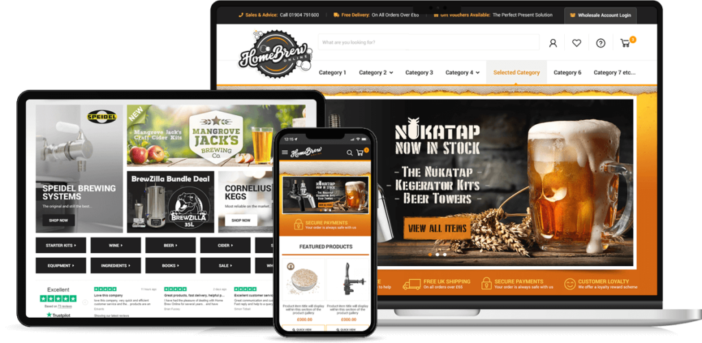
The vivid orange and black in this custom BigCommerce design for HomeBrew Online are both high energy. However, being next to each other on the colour wheel means they sit together comfortably, working in harmony. Perfect for a company selling fun, enjoyable products.
A white background gives a crisp, clean and professional look.
Also, this brand wants to say that buying from them is easy, and black and white are easy for customers to read.
Black and white together is the best colour scheme for ecommerce because it is practical, professional and versatile. You can also use grey, but beware that in bright light, all but the darkest shades of grey can disappear. This is a problem for mobile users.

Danger and Mystery
Using lots of black creates a more mysterious and masculine feel for a website. This custom Shopify design for AggroTec uses black heavily.
Logo colours of grey and green then carry through the site, projecting power, authority and even an element of danger.
Orange accents compliment the red and bring warmth. As mentioned earlier, orange is also a good colour for helping customers to feel confident. That’s why it is a common choice for buy now buttons. Also, for Aggrotec, selling motorsports equipment, power, thrill seeking and confidence are all central to their brand.
Pay attention to the colour schemes of the online stores you visit. Then, think about the experience you’re creating on your own site through the colours you choose. Notice how those colours fit together and how they feel. Are they energising, calming, or neutral? Do your colours work against each other, or do they send complementary messages? The best colour schemes for ecommerce websites are designed to create an emotional experience.

How the best colour schemes for ecommerce websites are put together
Colours have individual meanings, and so you should choose colours that speak about your brand. However, there’s more, the best colour schemes for ecommerce websites are created with colours that contrast and compliment each other.
Complementary Colour Scheme
Colours that are opposite each other on the colour wheel are considered to be complementary colours (example: red and green).
The high contrast of complementary colours creates a vibrant look especially when used at full saturation.
Complementary colours are tricky to use in large doses, but work well when you want something to stand out. So they are perfect for buttons.
Split Complementary Colour Scheme
The split-complementary colour scheme is a variation of the complementary colour scheme. In addition to the base colour, it uses the two colours adjacent to its complement.
This colour scheme has the same strong visual contrast as the complementary colour scheme, but is more harmonious.
The split-complimentary colour scheme is a good choice for beginners because it is simple to use.
Triadic Colour Scheme
A triadic colour scheme uses colours that are evenly spaced around the colour wheel. For example, purple, green and orange.
Triadic colour harmonies tend to be quite vibrant, even if you use pale or unsaturated versions of your hues.
To use a triadic harmony successfully, the colours should be carefully balanced – let one colour dominate and use the two others for accent.
Monochromatic Colour Scheme
A set of different shades and depths of a single-colour form the monochromatic colours.
Analogous Colour Scheme
Analogous colour schemes use colours that are next to each other on the colour wheel. For example, blue and green. They create serene and comfortable designs.
Make sure you have enough contrast when choosing an analogous color scheme.
Choose one colour to dominate, a second to support. The third colour is used (along with black, white or grey) as an accent.
Square Colour Scheme
A set of four colours spaced evenly around the colour wheel is a square colour scheme.
The square colour scheme works best if you let one colour be dominant.
You should also pay attention to the balance between warm and cool colours in your design.
Diadic Colour Scheme
A set of two colours with the primary colour and the one that is a colour away from the main colour is Diadic colours.
Tetradic Colour Scheme
A set of four colours made using Diadic colours and their respective complementary colours are known as tetradic colours.
This rich colour scheme offers plenty of possibilities for variation.
However, the tetradic colour scheme works best if you let one colour be dominant.
You should also pay attention to the balance between warm and cool colours in your design.
Secondary Colour Scheme
A set of three colours formed using green, purple and orange is secondary colours.
Creating best colour schemes for ecommerce websites with isolation effect
The isolation effect states that a colour that stands out is more likely to be remembered. For example, if someone looks through a list of words typed in black with one word highlighted in red, they will likely remember the red word more than the black ones.
Use this to your advantage by choosing one colour to be your store’s isolation colour for your calls-to-action, add to cart, opt-in, and other links. You can then use that colour in places that you want to stand out. For example, if green was your isolation colour, you would use it on your add-to-cart buttons and the text links that lead your customers directly through your sales process. By staying consistent and only using this colour for important action points, you are training your visitors to click when they see your isolation colour — green in this example. This is a subtle yet powerful way of keeping your customers moving toward purchasing. It’s like giving them subconscious trail markers to follow.
Customers are now subconsciously accustomed to following isolation colours, and using them makes shopping very simple. The best colour schemes for ecommerce websites are often just black, white and an isolation colour.
For an isolation colour scheme, you can add your logo to a simple ecommerce design like the BigCommerce minimal theme below, and just select an isolation colour. As easily as that, you have an attractive, modern website with one of the best colour schemes for ecommerce websites.
If you wish to discuss how we can develop your brand with branding and web design services, take a look at our ecommerce website portfolio and fill in the contact form there.


